Advertisement
Click to download now, finish the installation quickly, and directly unlock the "all-round experience"
Advertisement
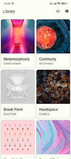
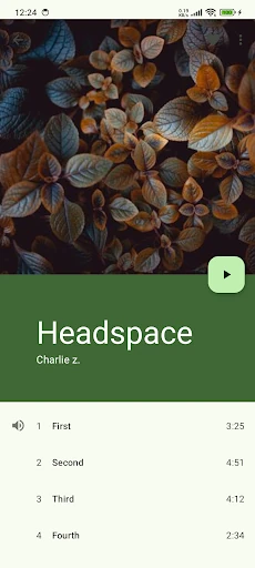
Screenshots


Click to download now, finish the installation quickly, and directly unlock the "all-round experience"
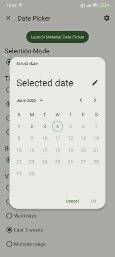
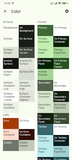
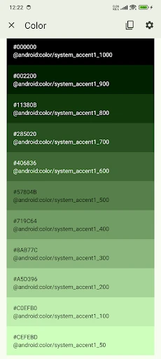
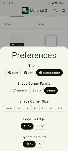
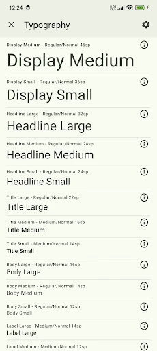
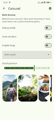
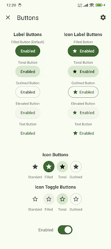
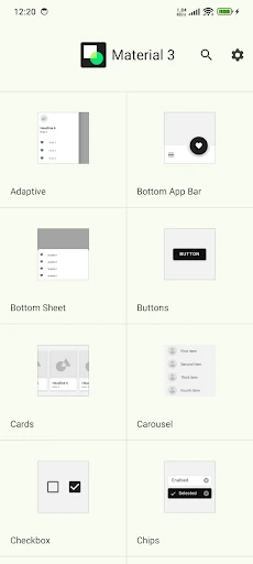
Material Design Components serves as a definitive reference implementation of the Material 3 (M3) design system. Positioned within the Libraries & Demo category, this application acts as a living bridge between static design guidelines and functional code. It provides an authoritative showcase of Material Design Components, offering developers and designers a tactile environment to test UI behavior, responsiveness, and aesthetic cohesion. By utilizing the latest Material 3 standards, the app demonstrates how to streamline collaboration and build high-fidelity interfaces that are both accessible and visually compelling.
The interface is a masterclass in minimalist efficiency, adhering strictly to the standards expected in the Libraries & Demo category. The UX is designed for rapid exploration, utilizing clear categorization and intuitive navigation patterns like the Navigation Rail for larger screens and Bottom Navigation for mobile. Every element behaves exactly as the Material 3 specification dictates, providing a "gold standard" experience that serves as both a tutorial and a benchmark for third-party application development.
To further empower the developer community, the app should introduce an interactive "Dynamic Color" sandbox, allowing users to see how specific components react to custom seed colors in real-time. Additionally, adding a "Copy Snippet" feature for Jetpack Compose directly within the UI would significantly accelerate the prototyping phase for mobile engineers.
This application is an indispensable tool for Android developers, UI/UX designers, and mobile product managers who aim to stay at the forefront of the Google Play ecosystem. It is specifically tailored for those implementing Jetpack Compose, Flutter, or Kotlin-based layouts. As a reference tool, it is unparalleled, earning a high recommendation for anyone looking to master the Material 3 design language.